Well, we do! Greenville, South Carolina is a wonderful city with lots to offer in the arts world. With the building of the Peace Center for the Performing Arts in the 1980s, Greenville began it’s journey to become a city full of arts & culture. Eventually there were small performing arts theaters and museums that give you plenty of educational and creative entertainment in our small city.
Here’s a list of some theaters and museums you might like to visit:
The Children’s Museum of the Upstate, The Logos Theatre , Greenville Theatre, Furman University Upstate History Museum, CentreStage, The Academy of Arts, Greenville Center for Creative Arts, Greenville County Museum of Art
But back to the topic of this post… Greenville’s Music Museum. It’s only one of three like it in the country!
Recently I was hired to rebrand the museum. What an exciting and fun project! Formerly known as Carolina Music Museum, they had been given a large instrument and financial endowment from the Marlo Sigal family, so they decided to change their name to the Sigal Music Museum.
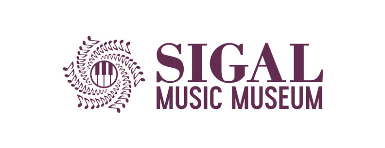
The first challenge was to create an icon that represented music. I wanted something inspiring that flows and moves. Since music notes cross across all kinds of music, that seemed the right direction. The design took shape as a beautiful “flower” shaped, spinning notes piece of art. The next part was what to put in the middle. We were open to a lot of ideas, but landed on the piano keys, because one of the founders, Tom Strange, is a keyboard expert and his passion is restoring old pianos. Plus the museum hosts a lot of amazing pianos, including one Mozart played!
Next I developed a custom version of the classic font Bodoni for the word Sigal and combined that with a newer font for Music Museum to create a lasting “old with the new” font combination. Thus forming a complete logo design that will work in many different situations.
After the logo design is complete. I designed letterhead, notecards and business cards to carry the brand all the way through.
One of my favorite things to do with new logos, is to design complimentary pieces that begin to add depth to the brand. this design is reflective of a “record” from the mid-20th century era to be used as a coaster, magnet and other branding pieces.
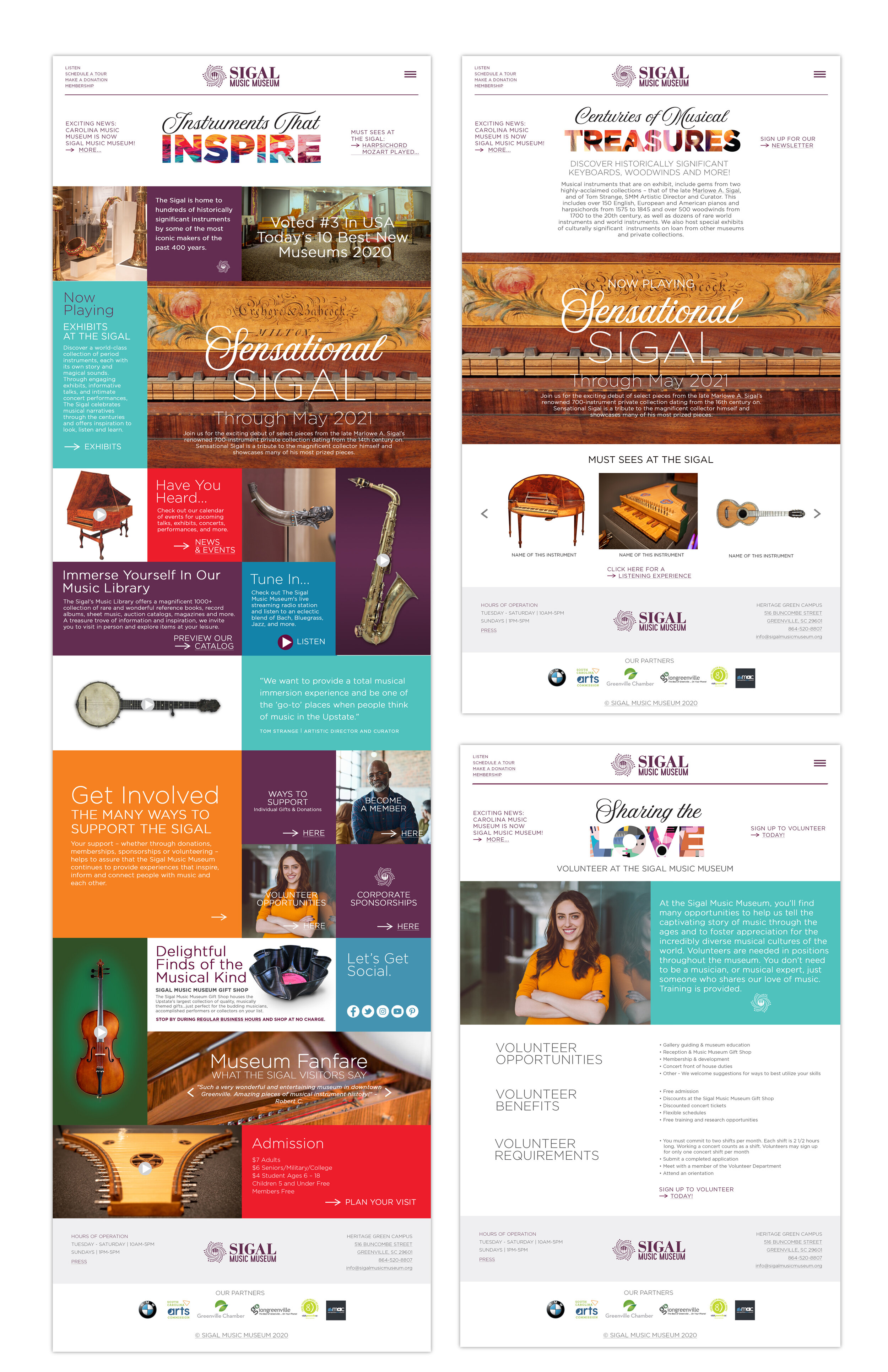
Next in the branding process is the website design. This website needed to be extra ordinary and have inspiration and flow to it. You can check it out here. I wanted something that was colorful and interactive. On the home page you can listen to each instrument play, so you can see how they sound.
Lastly, I felt like the reason that a lot of people didn’t know we have a music museum is because the signage was high up on the front side of the building. Sign placement is critical in any establishment who is serving walk-in customers. Because the museum is in the middle of a curved, 4 lane road, I felt there needed to be a sign designed to suit a location at the corner of the building at eye level for drivers. This monument sign will draw a lot of attention to the newly branded museum.
All told, this was an amazing graphic design project! Tonia Hubbard has been a joy to work with and I look forward to this museum getting more and more notoriety in the future! And if you’re in Greenville, plan a visit.


