When you’ve been doing graphic design as long as I have, you tell people, “You name it, I’ve probably designed it in my 30 years.” From logo design to interior design, I get to do some really fun and cool projects. Dang I love my job!!
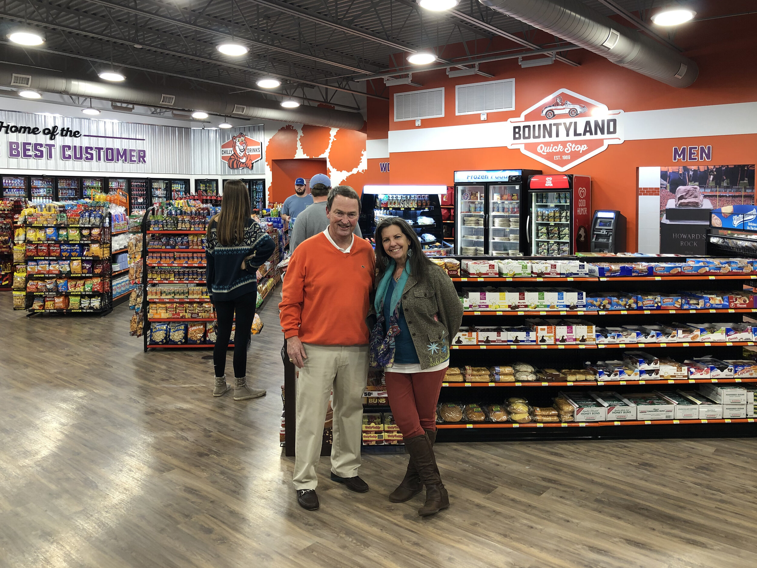
In 2018, I had the privilege to rebrand Bountyland Quick Stop at 228 West Cherry Road in Seneca, SC, right outside of Clemson University. They were building an entirely new type of convenience store and wanted a new brand and look to go with it. The store has been around the Upstate of SC since 1969. They had been very successful in purchasing existing gas station and turning them around. This project was a new, ground -up venture for Bountyland.
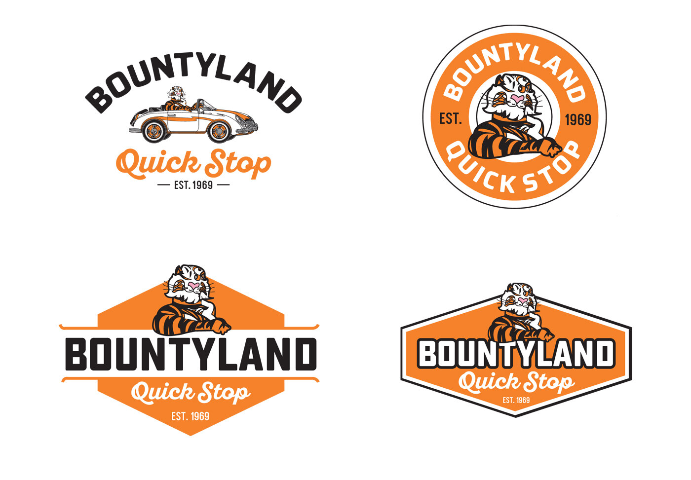
Their old logo was really interesting and reflected the old Esso station tiger. Since this location was near Clemson, the owner, David Land really wanted to keep the tiger and use it to the brand’s advantage. I liked the vintage look of the old design, so we agreed to keep a portion of the old logo and work it into something that is suited for today’s consumer.
The one thing the old branding didn’t have from store to store was consistency. The fonts were often different depending on who worked on the signs. My goal was to design a logo that could be used across the board and slowly integrated into each location as signs needed to be replaced.
The initial designs revealed my desire to keep the 1960s look of the logo, but give it the new look they needed. But there was just one major problem…the tiger. His face was so strange I couldn’t make out just what the initial designer was going for. I knew he had to be redrawn. Creating a character is one of the biggest challenges for a designer. There have been so many over the decades of logo design, that its really challenging to do something original. I set out to do just that. I knew he had to have “attitude” and a relatability that consumers would be drawn to. This is a long, arduous process, but the end design was wonderful. It’s so interesting to see these characters literally take life on the page in front of me!
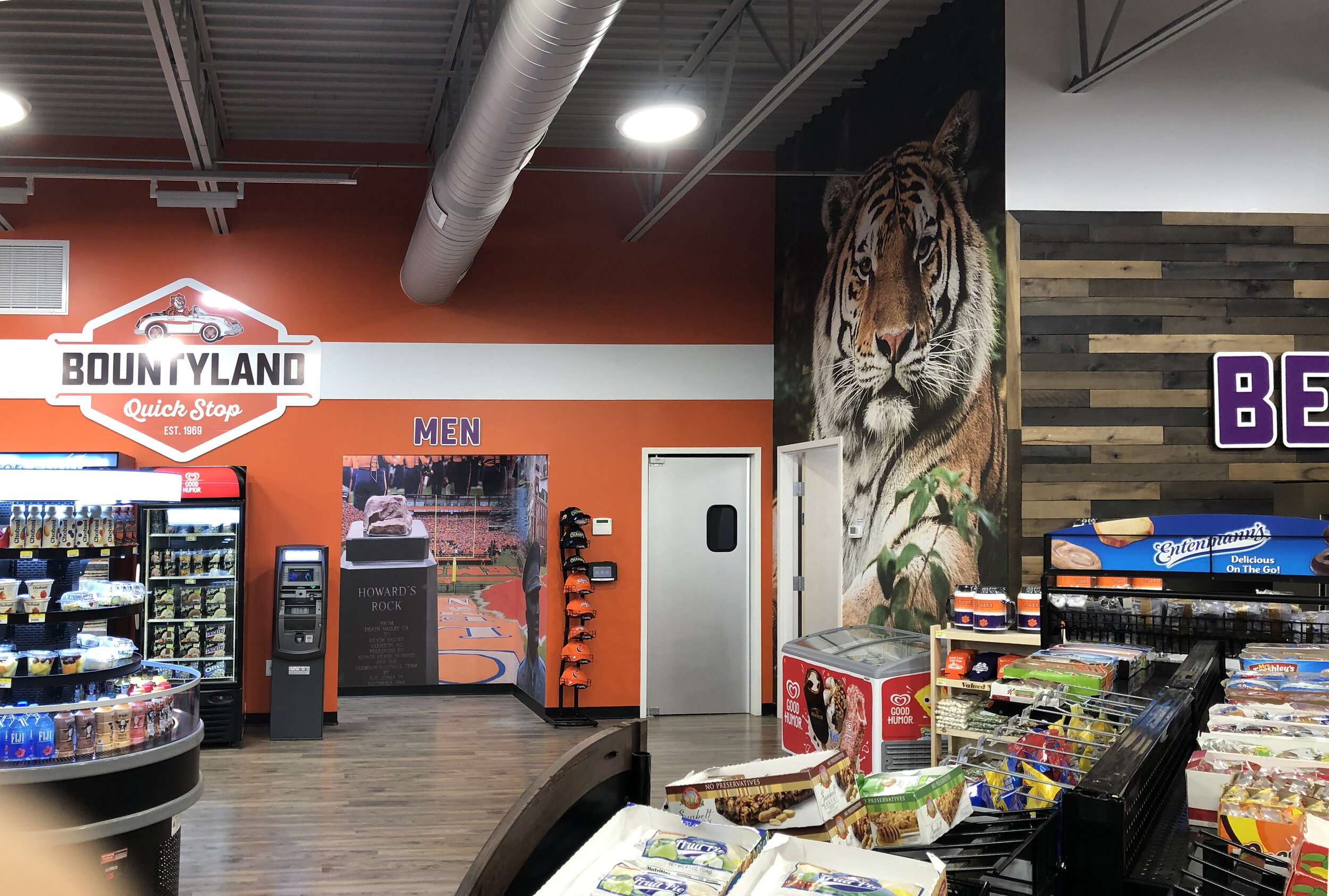
The final logo design was a hit with the client, so the next step was to turn it into an exterior sign. Any time I design a logo for a retail store client, I design it with signage in mind. This sign was a nice addition to the beautiful exterior of this store. After designing the sign, I also had the opportunity to design the exterior accent colors on the building, giving the building a consistency of brand without overpowering it.
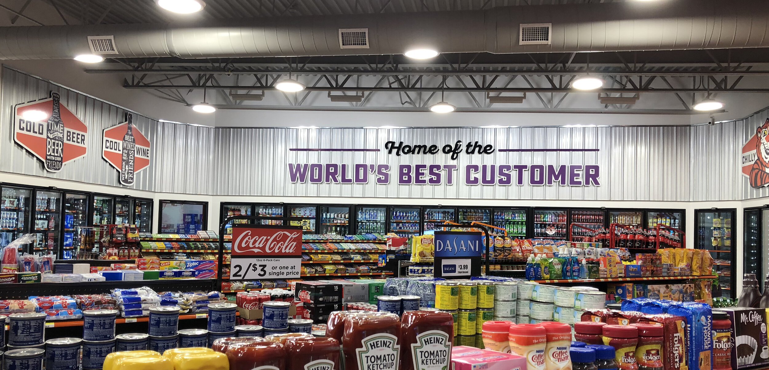
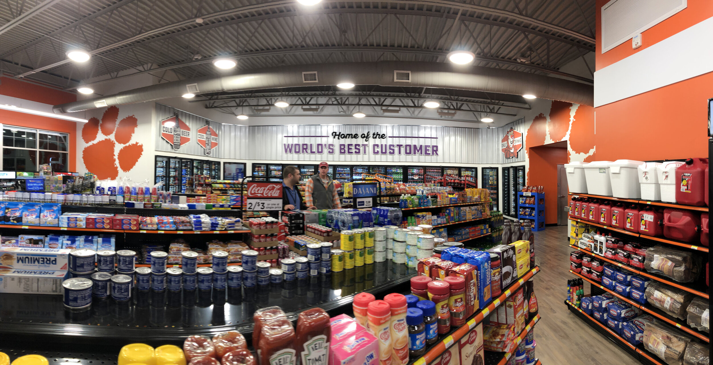
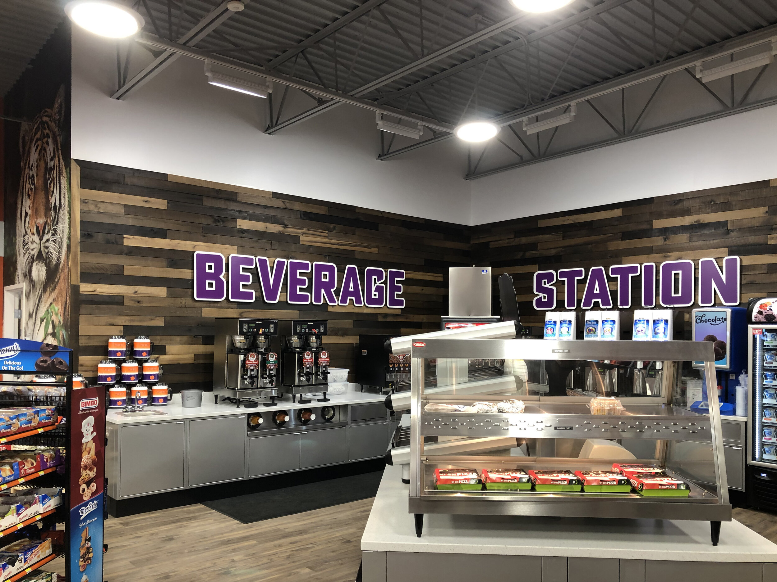
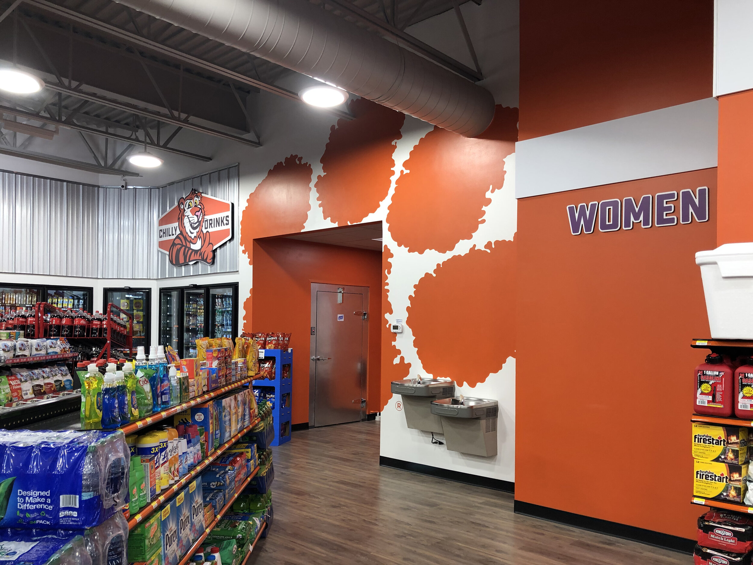
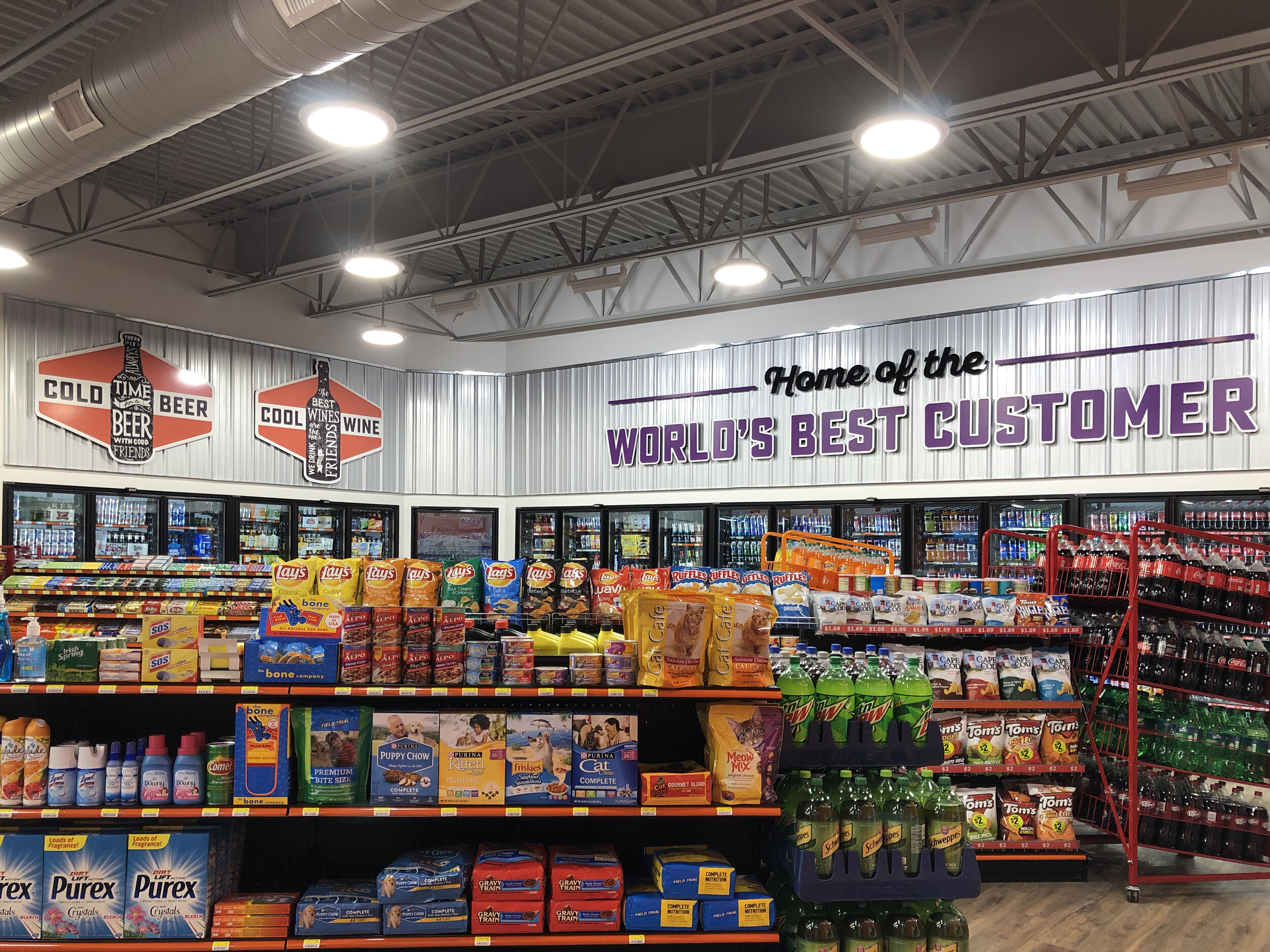
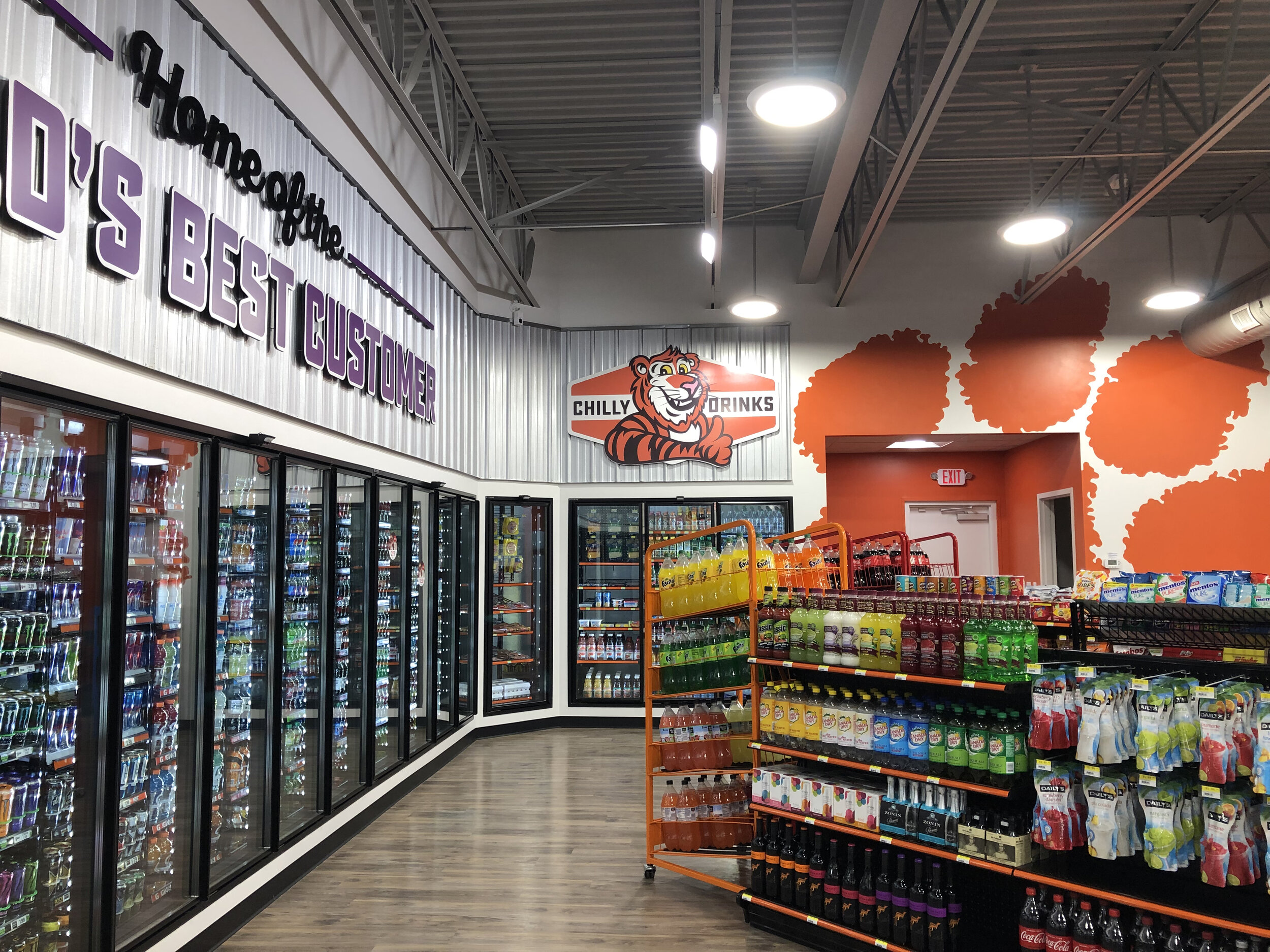
Next the interior signs had to be designed. Each section of a convenience store has a specific products and it’s my job to make it fast and convenient for customers to find what they need. The customer needs to easily see where each major item is housed in the store. The client also wanted to go big with the Clemson tiger theme. He is a big supporter of the Clemson athletics program and even had the athletic director’s number on his phone. In one phone call, he got authorization to use the trademarked tiger paw on the walls. I hired a mural painter and engaged the sign company, Instant Imprints in Greenville, SC and set to work designing the interiors from early construction photos.
Initial rendering approved by the client.
After the rendering was approved, we set to finalizing the flooring and counter materials, bathroom tile selection and interior paint colors. The final project turned out just as designed and even better in real life. David Land was so fun to work with and at the end of the job he said in his adorable Southern twang, “Not only did you come in $85 under budget, we got so much more than we budgeted for. We wouldn’t have been able to do all of the wood an metal with the other quotes we got.” Makes a designer proud!
This was by far the most fun project I’ve done in years! Mighty Mouse Productions is a small, one-stop-shop for all of your branding and marketing needs.
