
Head Quarters Salon & Day Spa
Head Quarters Salon and Day Spa was established in 1980. They have a strong and lasting presence in our city. Located just North of downtown Greenville, SC, they're building is as unique as their attitude about beauty. Where some salons are kinda stuffy, HQ offers a comfortable, relaxed atmosphere for every walk of life.
Head Quarters Original Brand
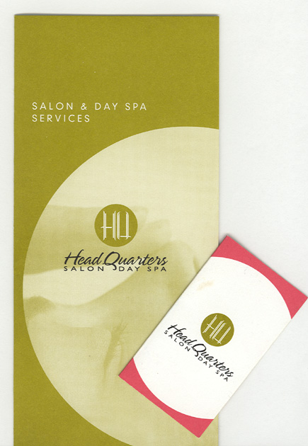
We started working with Head Quarters in 2002. They had a basic logo that they were happy with, so we started with a "circle" concept to carry the brand through. This is one of our signature concepts. To us things that reinforce the brand, are the elements from the logo that you can subtly add to the marketing pieces. This brochure of services and folded business card that also had the basic list of services did just that.
HQ Services Brochure 2005
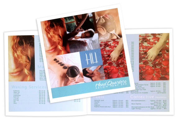
This client loves change! This is the services brochure we designed in 2005. the cover collage and lighter colors gave her a fresh new look that invigorated her salon. with 100s of offerings, these small, but unique brochures still fit into the square folders we had originally designed.
HQ New Logo
In 2009, this client decided she wanted a new brand. The old "HQ" was too stiff and had lived out it's life (we did not design the original HQ). We did design the font however and made the decision to keep the font as we had originally designed it, but redesign the icon. One criteria we have is that the icon be strong, unique and able to stand on it's own. This design lends itself to work with and without the oval. The oval gives it kind of a "thumb print" concept to communicate just how unique every client is to them and the "HQ" letters reveal their signature on their work.
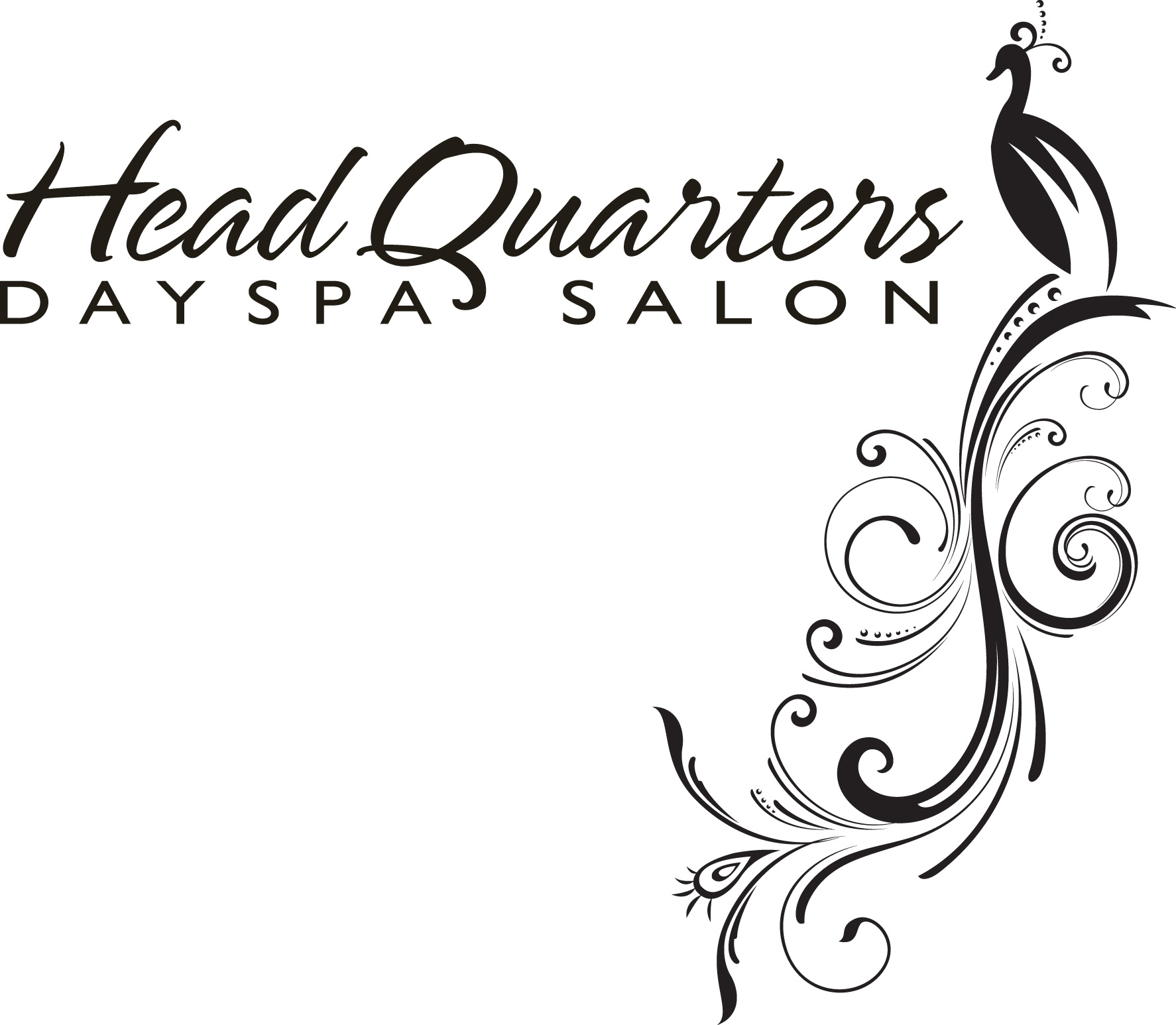
Peacock Flourish
Peacocks are beautiful and unique. We wanted to give her a design element as a secondary concept. This design lends itself to use as a background element and creates a nice texture for their marketing pieces.
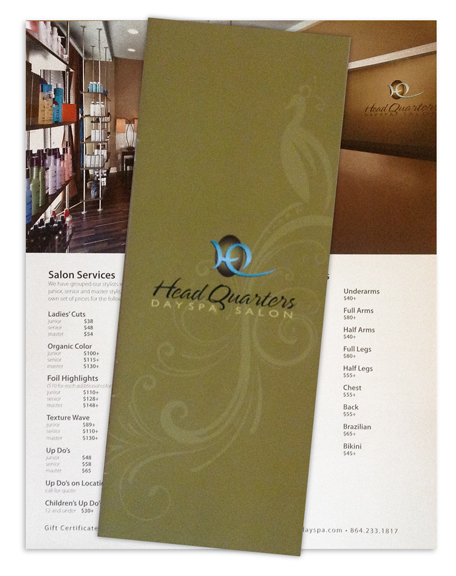
2009 Services Brochure
This new design incorporates the peacock design. With professional photography, the new brochure has beautiful interior photos of the salon. We made the size bigger to show off the new photos. Each person who comes in requesting a list of services receives this large showpiece of services that makes a nice impression.