

The Montessori School of Anderson was a growing school and they needed a new brand to show it.
The Montessori School of Anderson was a growing school and they needed a new brand to show it.
Montessori Logo Design
This logo was challenging. As much as we love teachers, they are too smart for us! Our goal was to show that the Montessori way of teaching took the whole child into consideration. I was fascinated that they use colors to teach English and shapes to teach social studies. This "full circle" design was fun and identifiable.
Capital Campaign Brochure/Pocket Folder
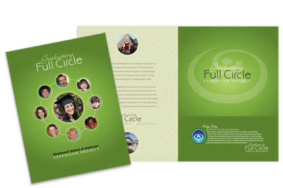
This piece was designed for the capital campaign to raise money to build the high school. "Graduating Full Circle" was our concept to show that this high school would complete their program of lower education-from 18 months through 12th grade. We combined the brochure and pocket folder into one piece with a pocket in the back for sponsorship opportunities.
Montessori School Large Brochure
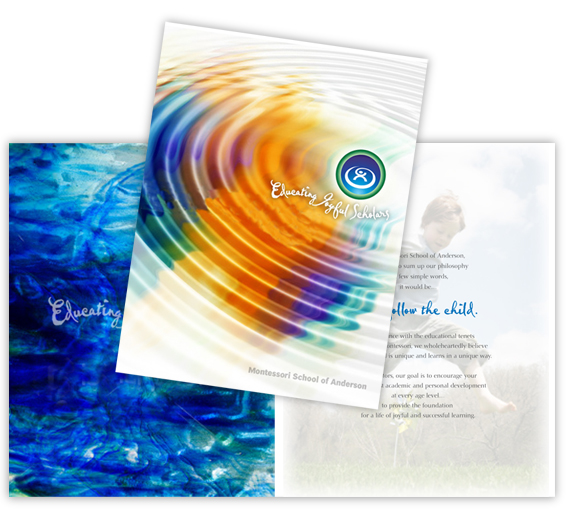
Montessori is a wonderful learning method. We were inspired by the way the use colors to teach grammer. Each subject plays off of each other. It's like a ripple effect...